RetailMeNot Brand Refresh
Branded, creative, and accessible visual refresh that honors the brand’s identity while refreshing its visual presence.
As part of the brand’s visual refresh, Matt set out to infuse our digital presence with dynamic movement across our website, social media, and email campaigns through the strategic use of animated GIFs. Research shows that incorporating GIFs can boost website conversions by over 103%, while video content on social platforms can enhance engagement by up to 38%.
To further amplify our impact, we adapted these vibrant designs for our programmatic ads, achieving impressive click-through rates of up to 2.01%. By introducing movement into our marketing strategy, we not only expanded our brand’s reach but also fostered deeper connections with our audience through compelling visual storytelling.
Website Refresh & GIF Additions
The Storytelling GIF Challenge
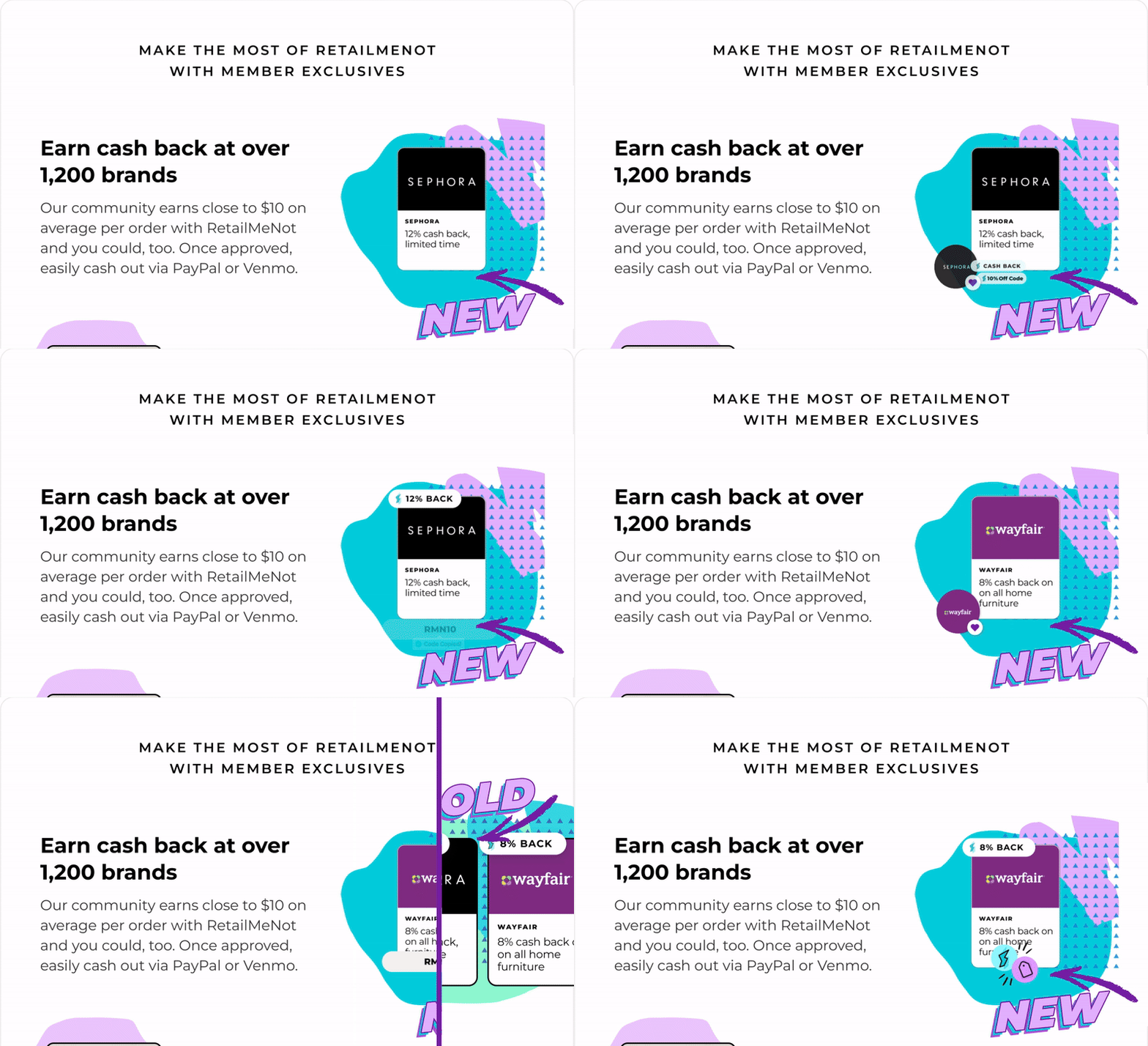
Matt tackled the challenge of visually conveying the extensive capabilities of this app, particularly its ability to automatically stack cash back and coupon codes during purchases, all within the limited timeframe of a repeatable GIF. To tackle this, Matt crafted a compelling visual narrative featuring two prominent merchants, seamlessly integrating our UI buttons and design elements.
The story kicks off with a user clicking a coupon code for 10% off, immediately showcasing how cash back is effortlessly added to their experience. This dynamic GIF has significantly boosted engagement across our website, email campaigns, and social media platforms, turning complex functionality into an enticing, easily digestible visual experience.
Promo Badge Refresh
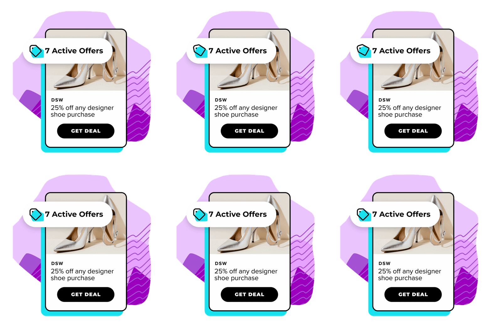
As part of the brand refresh, Matt redesigned this promo badge lockup to maintain core visual elements while giving it a more refreshed, dynamic feel. He added more contemporary texture to the typography and utilized the updated color palette for stronger contrast and better visibility across digital platforms, ensuring the design was eye-catching, clear, and adaptable for use in emails and on the website.
Matt preserved key visual elements while giving the badge more branded character resulting in a more contemporary look. This updated design stays true to the brand’s identity while feeling fresh and engaging, enhancing its impact across marketing channels.
Rich Push & Content Card Refresh
Matt updated the visual design of RetailMeNot's push welcome series, including rich push notifications and content cards, to align with the refreshed 2024 brand guidelines. The redesign introduced a more cohesive and vibrant presentation, replacing the functional but static pre-refresh visuals. The previous designs, while clear, lacked engaging typography, dynamic elements, and the bold color palettes now central to RetailMeNot's refreshed identity.
The new visuals prioritize clarity and user engagement, leveraging best practices in visual hierarchy and mobile-first design. By incorporating bold typography, enhanced contrast, and playful elements like icons and illustrations, the updated designs emphasize key messages while maintaining balance and readability. These changes not only reflect the brand's energetic ethos but also improve engagement, creating a more compelling and on-brand experience for users.
2024 Brand Style Guide Refresh
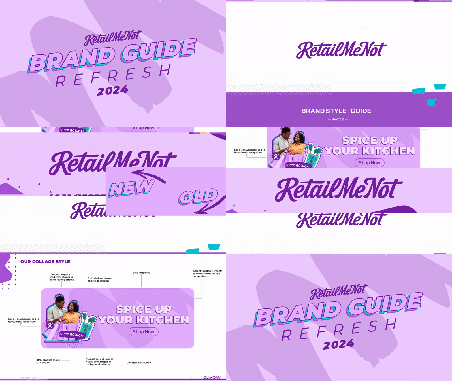
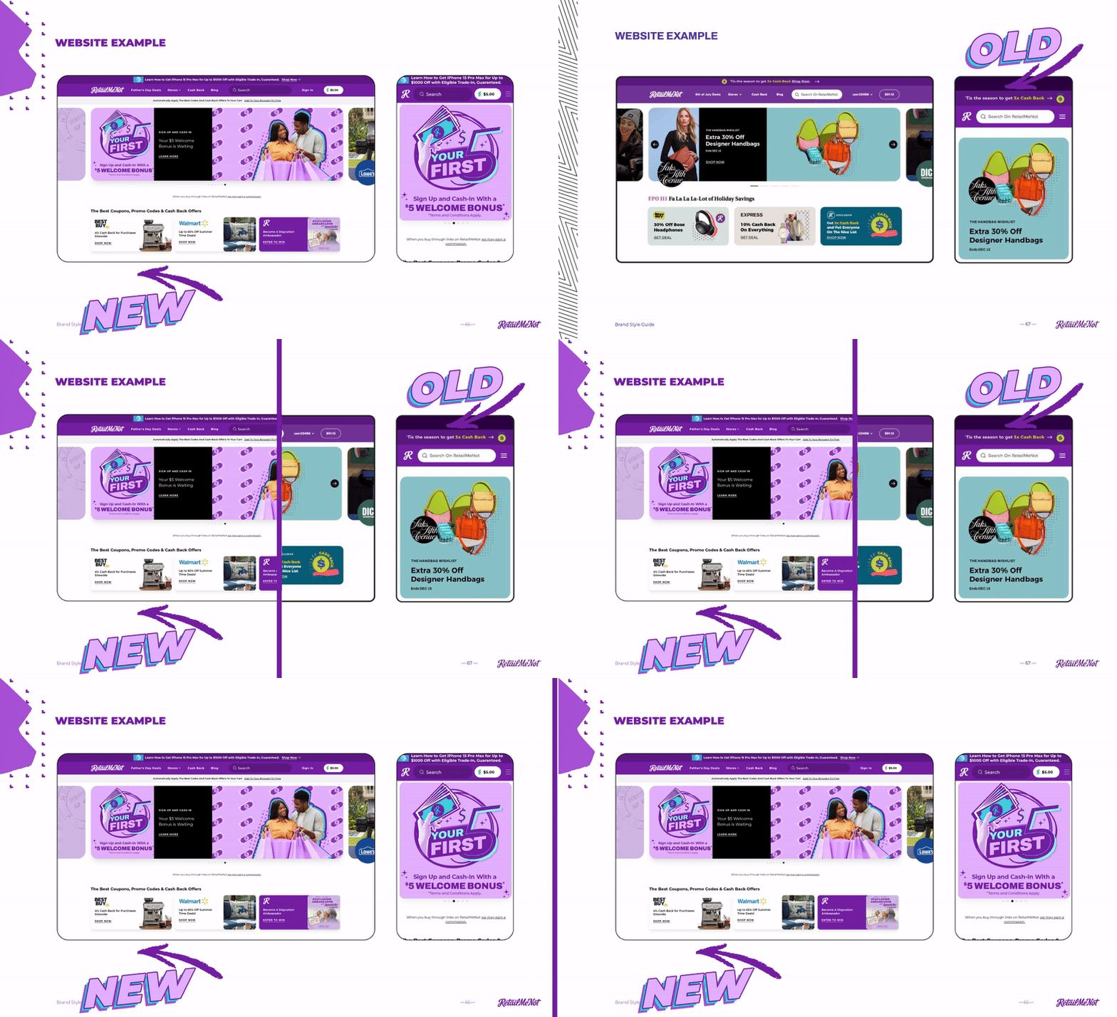
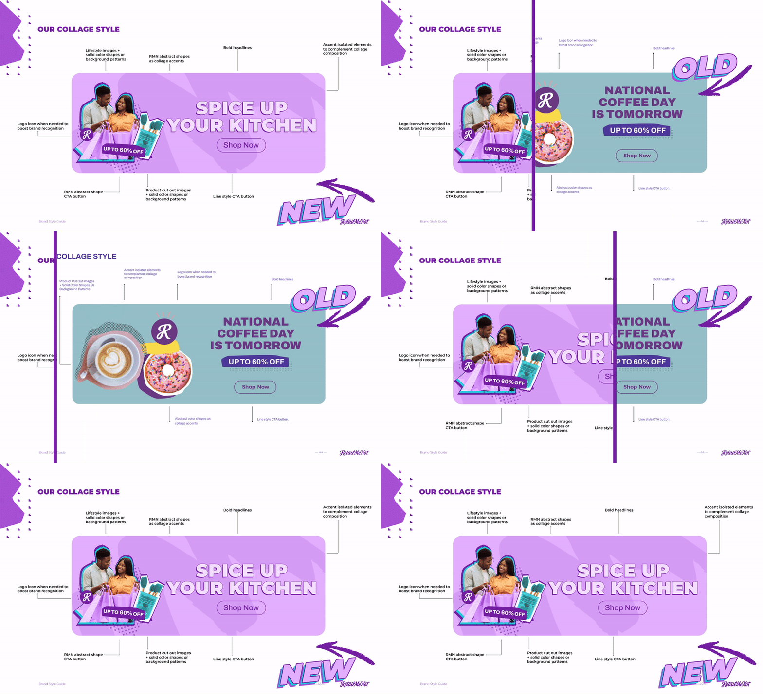
Conducting a brand style guide refresh involves a comprehensive audit of existing assets to identify what’s performing well and which areas would benefit from an update. It’s essential to preserve elements that resonate with the brand's identity while thoughtfully updating those that may feel outdated. This process should also prioritize accessibility in line with ADA guidelines and ensure diversity, equity, and inclusion (DEI) principles are reflected in lifestyle imagery. By honoring the brand’s heritage while refining its visual identity, we can create a more defined and recognizable presence that resonates with a wider audience. Here are some examples pulled from the updated brand style guide that Matt refreshed in 2024.
Example of refresh to the website.
Example of refresh to the color palette.
Example of refresh to the collage style.
Accessibility & Representation
Matt collaborated closely with the company’s DEI counsel to ensure that visual elements reflect a wide range of identities and experiences. By utilizing inclusive imagery, brands can foster a sense of belonging and resonance with their audience. Additionally, he prioritized accessibility in our design choices by implementing background color tints within the color palette. These tints allow colored text to maintain readability against brand colors, adhering to ADA compliance standards. This methodology not only enhances visual appeal but also ensures that all content is accessible to everyone, aligning with best practices for ADA readability and reinforcing the brand's commitment to inclusivity.

